As part of applying what we learned from Term 2, we were asked to make a completely new 30 second animation involving two completely different characters. I thought this would be interesting to see if anything I apply differs from my previous work I have carried out, so I got straight into designing two different characters.
I tried to focus on two complete opposites again. This time, instead of focusing on an argument, I would focus on the characteristics of the characters and see where I go from there. I decided I would focus on cleanliness and dirtiness as this opens up many gates for an interesting story.
I came up with a deer, and a pig, but i decided to swap around their characteristics, since pigs are usually regarded as dirty, rolling around in mud and being covered in dirt, and deers are never seen as particularly filthy, and I could think of distinguishable personalities for the characters to work off each other.

First, I felt it would be useful to draw the animals from existing art styles, and see if I could morph them together into one.

The first drawing of the pig (on the far-left) resembles the design of Peppa Pig. I felt this was appropriate as this was a simple design, and our task was to try and keep the animation simple.
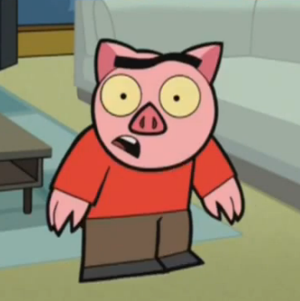
The second drawing of the pig (mid-left) resembles the character design of Spanky Ham from the animation "Drawn Together". This character is supposed to be a crass impression of South Park characters, and I felt that the simple design was good enough to help me make my character.
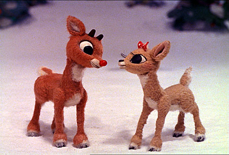
The first reindeer drawing (mid-right) was drawn to resemble a 2D cartoon style of Rankin & Bass' popular 'Rudolph the Red nose Reindeer' stop motion, which is my favourite Christmas story. I felt that the simple shapes used to make the character would also translate well onto paper, and although I do have a good idea of how it would look in 2D, I felt that maybe it would be difficult to animate a quadruped on four legs, so I tried to find something else.
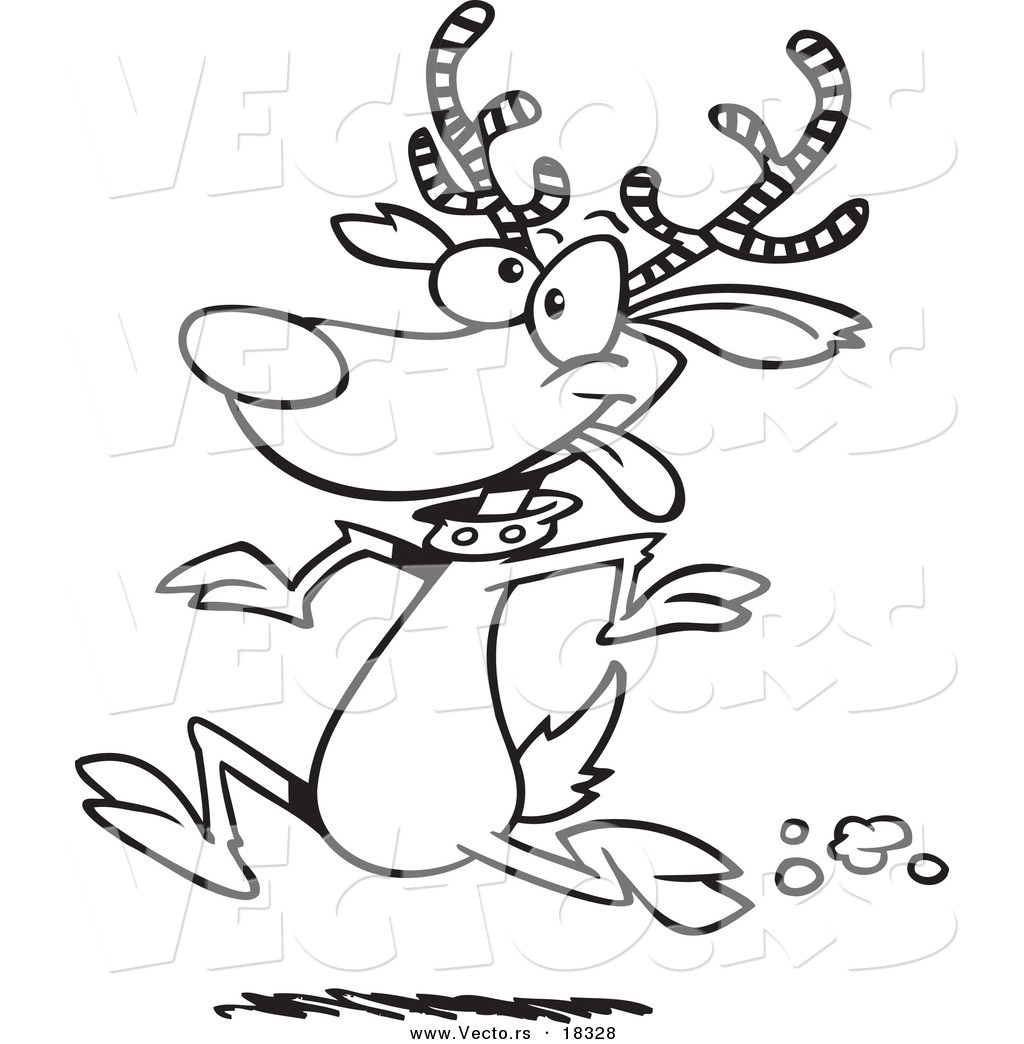
The second reindeer drawing (far-right) was drawn of an image I found on Google from a website that provides vectors. I thought this was much more appropriate, and I found that in drawing it, I drew it slightly different to the image, so I went with this image as my initial reindeer reference.

When I was happy with what I had got, I drew out the characters above a possible background for the characters to be set in.

I finally scanned it into Photoshop and drew the characters with colour and different clothes. The suit and overalls seemed too much for these characters, as the suit would make the pig seem too much like a business man when I just want him to be a high society, relaxed pig, and the deer's overalls didn't appeal to me, so on a separate layer, I drew completely different costumes and was happy with what final results.

Originally, the background setting I had in mind for the setting would be red, and I felt that the pigs robe would blend with the background, so I made it Yellow. I think this fits more as it seems to work with his skin and trousers.
Above is a 360 turn of both characters in their final form. Doing a 360 helps me decide the shape of both characters from different shots I would have them in.
I am happy with my character design progression because I have taken a totally different approach to the work and have come out with a quicker result than the last animation.
Finally, when the characters were finalized, I decided to get a head start on making the backgrounds. To keep the theme simple, I thought it would be useful to try and keep the background simple.
I took inspiration from the online animated series, Eddsworld, to help me get a good idea on simplistic backgrounds, and I noticed that the background images had no outline, except for the foreground, making the foreground much more visible. I thought I would try and replicate this myself.

Much like the last project, I wondered if putting the characters in completely different settings would help to add to their personalities. When I drew two different designs, I took them into Photoshop to add colour and see if they would work.

For the top background, i thought it would be good to see if I could make a simple background out of an outside environment, but when I added colour, it became apparent to me that it would be very distracting for the characters. The fence would get in the way, and I wasn't sure how I could make a short yet funny scenario out of this setting.
The botton background came out looking much better. The inside living room setting definitely is the best environment for my characters. I wasn't particularly happy with this design though, so I redrew the background.


My final background ended up coming out like this. This is a simple, yet effective background with the appropriate foreground objects, background colours and enough life in the living room for it to look like a realistic setting.

No comments:
Post a Comment